Showcase and enhance your brand’s visual identity in a clear and helpful way
Wayfinding signage also known as directional signage is vital to help your clients and customer find their way around your business premises. Effective directional signs can provide helpful information, give directions, or provide warnings. In some cases, you can install wayfinding signs to improve the customer experience. In other cases, regulatory signage may be a legal requirement to improve safety and security.
At Sunshine Sign, we know the importance of high-quality, durable signage. Having the right signs can help attract customers to your store and help you stand out in a crowded marketplace. However, having wayfinding signs is of equal importance.
For example, directional signs can help a customer from the moment they drive into the parking lot. Wayfinding signage is crucial In complex buildings like hospitals, education facilities, or multi-tenant office buildings. Signs can provide the right directions, show maps, and provide visual instructions.
Our expert designers combine art, psychology, color, typography, and symbols to help your client, customers, and first-time visitors navigate your space as seamlessly and effortlessly as possible.
What are Wayfinding Signs?
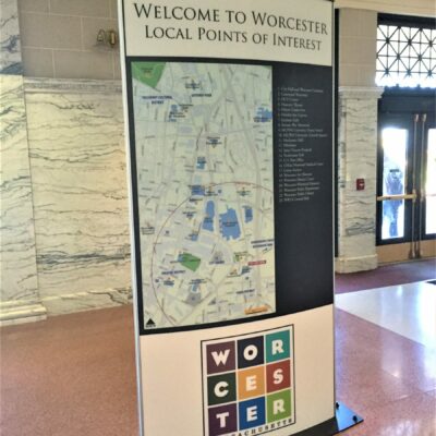
Wayfinding signage refers to any type of visual cues or instructions to help a person get where they need to go. Two distinct forms of wayfinding signs outside a building are architectural and monument signs. Interior wayfinding systems can include maps, directories, and pictograms. Even arrows along a floor are helpful to provide direction.
Why are Wayfinding Signs Important?
Having a wayfinding system is a crucial element for every business. Any visitor to your premises must quickly know where they are, where their destination is, and how to get there. Moreover, providing direction avoids chaos, helps maintain order in a building, and enhances the overall customer experience.
There is another reason why having a wayfinding sign system is vital. A well-designed, easy-to-read directional sign provides an excellent opportunity to improve your brand awareness. So, the signage system helps guide people to your business who, otherwise, may just pass by.
Four Types of Wayfinding Signage
An informative wayfinding system consists of four distinct types of signage. To guide visitors through the physical environment, you could use one or several types of signs. The signs can provide direction, include helpful information, identify rooms or businesses, or regulate behavior.
Whatever information system you install, the signs should help customers and visitors find where they need to go in the shortest time possible.
Let’s look in more detail at four types of wayfinding signage that can improve the look of your building and give visitors the information they require.
Directional Signs for Businesses
Directional signage gives visual cues to guide people where to go. For example, a directional sign placed at an intersection or areas without a clear traffic flow will instantly show the way. This means that anyone unfamiliar with the physical environment will navigate through the premises using signs as if they know where they are going.
For directional signage to be functional, you should approach the wayfinding systems from the perspective of someone visiting for the first time.
First, the sign should be simple, straightforward, and eye-catching. This requires that in a few seconds, the visitor gets the message. Second, it’s vital to avoid leaving gaps along the route. For example, a directional sign should be at every intersection. This avoids people getting lost and backtracking. Lastly, it would be best to consider local traffic or footfall patterns. For example, visually attractive signs in a busy shopping mall or airport should be high enough to be seen from a distance.
Examples of directory signage
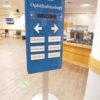
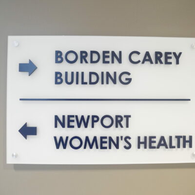
- Arrows pointing the way direct visitors to a particular area, office, store, or public facility.
- Color-coded lines on the floor are helpful to guide people through a large complex building. For example, colored lines are standard in healthcare facilities to get to specific departments.
- Directory signs can tell people where they are and can be similar to identification signs. Some examples are floor numbers, department names, or names or titles of occupants.
Directional signage is even more effective when the graphic design team incorporates your branding or color scheme to make experiential graphic design.
Identification Signs
Identification signage is the most common type of sign in a wayfinding system. The information sign lets a person know they have arrived. Additionally, the sign could identify wayfinding landmarks. So, think of these signs as destination signs rather than providing directions.
Simplicity and continuity are the critical features of any signs for identification purposes. First, the signage must clearly identify the building, floor, office, or room. However, continuity in color and design is also vital. For example, suppose a directional sign to “Admin” is blue. In that case, the “Admin” identification sign at the destination should also be blue.
It’s also a good idea to consider if you need a permanent sign or a temporary one. Sometimes the location or purpose of a space can change. Also, identification signage is vital on the outside of a building.
Examples of identification signs
- Metal or vinyl door plaques with a department name or room number.
- Signs hanging from the ceiling to identify the purpose of the space.
- Floor numbers at the exits to elevators.
- Wayfinding campus signs to identify buildings or addresses.
Informational Signs
Informational signs relate to the facility’s purpose rather than identifying the area or room. The signs can also answer a visitor’s questions before they have asked. For example, the signs could have information about opening hours, amenities, and available facilities.
One of the benefits of informational signs is that graphics or visual images can convey a message understood by people of all languages. This is because there are universally recognizable images that provide information about the purpose of a room or object. For example, restrooms, Wi-Fi, cafeteria, opening hours, and exits can all have information signage without letters or words.
Examples of how to use informational signs
- Information signs are helpful for facilities like bathrooms, exits, entrances, waiting rooms, and restaurants.
- Use signs to inform about amenities on offer like free Wi-Fi, drinking water, and elevators.
- Helpful information regarding addresses, hours of operation, and services is helpful in a sign format.
Regulatory Signage
Regulatory signs provide wayfinding information to regulate who can enter a particular area or room and address liability concerns. Or the signs could give warnings on wearing safety equipment or appropriate action upon entering or exiting the area. Some types of regulatory signage may be required by law. For example, emergency exits, the location of fire extinguishers, and ADA accessibility are typical examples of necessary signs in all public buildings.
When providing regulatory signage, you must consider using the appropriate color coding. Some colors have universal meanings. For example, red is associated with danger, restrictions, or forbidding — think of a red stop sign. Amber is usually a warning color. You will often see amber signage to warn of slippery surfaces, risk of electrocution, or radiation. Green usually provides direction. Therefore, exit signs are typically illuminated in green.
Additionally, mandatory signs are usually blue with white symbols or lettering on construction sites.
Examples of regulatory signs
Here are a few examples of signs that regulate behavior:
- No smoking, firearms, running, etc.
- Warning signs about high voltage, slip risks, or to exercise caution.
- Compliance signs have information in tactile lettering or to enforce health and safety regulations.
- Signs to control access. For example, employees only, no access beyond this point, no pets, etc.
Sunshine Sign Specialties
- College Campus Signage
- Arena/Sport Signage
- Streetscapes
- Awning
- General Contractor Signage
- Parks & Recreational Facilities Signage
Wayfinding Signage — The Five Principles
For good and effective wayfinding information systems, visual communication experts recommend sticking to the five principles. Then, using appropriate signs, you can send people in the right direction and arrive at their destination in the most efficient way. The five principles of wayfinding include the following:
- Give each location a unique identity — You could use colors, appropriate graphics, or unique visual effects.
- Use landmarks to provide visual cues — A simple way to provide large signage stands to create a point of reference.
- Have well-structured paths — In large buildings, have visual cues strategically placed throughout the route.
- Use a unique visual character for each area — A visitor should find it easy to work out where they are by observing the visual environment around them.
- Limit choice — Always limit the path to one route, even if there are multiple ways to reach the destination.

See Us At Work
[testimonial_view id=”1″]
Want to Work With Us?
Let our design team help you deliver the message your audience will remember.


